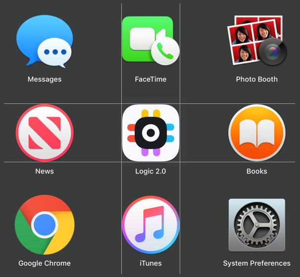
Today we’re launching a new simplified Logic icon, as part of our work to refresh the look and feel of the Logic application. Our new Logic application (Alpha version) is simple and playful; we wanted our icon to have the same look and feel.
Our previous icon was designed ~10 years ago (!) and doesn’t represent our new app design. The previous icon is hard to notice against different backgrounds and it doesn’t stand out among other icons. Also the shape of the icon was very complex. With our new icon we tried to solve all these problems. Our goal was to create a simplified and clean look that better represents our brand and application. We hope you like the new icon! 👍
Note: The new icon is only available in the Alpha version of the app on Windows and Mac. We are working on to implement this on Linux. Download the alpha app here: https://discuss.saleae.com/


